 |
 |
 |
|
 Register on the forum now to remove ALL ads + popups + get access to tons of hidden content for members only!
|
||||||||
 April 15th, 2015, 02:28 PM
|
#21 | |
|
Member
Join Date: Nov 2011
Location: Mountains of North Carolina
Posts: 78
Thanks: 4,825
Thanked 260 Times in 66 Posts
  |
Quote:
 and it might be an "old dog, new tricks" situation. and it might be an "old dog, new tricks" situation.Years ago I got an SE version of Pinnacle (that came with a scanner I bought) that had a color correction feature. As I recall, it would have you ID an area of the frame that was supposed to be pure white and then measure the "amount of correction" need to turn it white and then apply that amount to all the other pixels in each frame throughout the video. Pretty clever, but too simple an approach for most color problems, particularly this one. I tried separating the video into segments. Ones that were green tinted and ones that were not. The color correction wasn't too bad, but after all that I couldn't "stitch" the segments back together. Talk about irritating.  I had hoped that by now there were more sophisticated software, like the stuff you see on TV when they enhance a video of a license plate so it can be read. I think the human eye and brain do some color correction when viewing "The Seduction of Lyn Carter" or it might be that the eye and brain are "focused" on more interesting things in the frame rather than that green tinting.  |
|

|

|
| The Following 6 Users Say Thank You to Tryvek For This Useful Post: |
|
July 13th, 2015, 10:44 PM
|
#22 |
|
paludicolous paravant

Join Date: Sep 2005
Location: Perfidious Albion
Posts: 26,742
Thanks: 75,696
Thanked 745,843 Times in 26,862 Posts
|
One of my pet projects on VEF is the cover index for the German mag Sexy. Many of the covers there are scans, though the majority are auction finds, and as such typically photographs. One particular vendor has the unfortunate habit of photographing the covers whilst they are still in a plastic bag. The result of this is that it really dulls the colours.
Here are a couple of examples:    In comparison, this is what the last cover really should look like:  What I'd like to hear are some tips to reduce the effect of the dulling. I had a go at one of those images, throwing all sorts of things PaintShop Pro (my pic editor) has on offer at the pic. The result (below) is still not great, and worse - it was quite a bit of effort, as I was not really sure what I was supposed to be doing. Thus I'd like to know which settings I should tackle, so that I can turn this into a script to turn the whole affair into (eventually) a low-effort thing.  |
|
|
|
| The Following 8 Users Say Thank You to beutelwolf For This Useful Post: |
|
July 13th, 2015, 11:26 PM
|
#23 |
|
Senior Member
Join Date: Nov 2009
Posts: 349
Thanks: 4,439
Thanked 3,492 Times in 404 Posts
|
Maybe the first things that it must be notice is what settings we must to make,
and play a lot with the settings for discovering the appropriate ones. I made my trying using a simple, lite, and practical program called PhotoFiltre. I change the: saturation + 30% gamma - 0,70 contrast + 15%  Last edited by Candy Cane; July 13th, 2015 at 11:38 PM.. |
|
|
|
| The Following 7 Users Say Thank You to Candy Cane For This Useful Post: |
|
July 16th, 2015, 07:27 PM
|
#24 |
|
paludicolous paravant
Join Date: Sep 2005
Location: Perfidious Albion
Posts: 26,742
Thanks: 75,696
Thanked 745,843 Times in 26,862 Posts
|
 I have played around with PaintShopPro to find a setting would recover a bit of that dulled color, and so far the best results are using "Vibrancy" under Hue+Saturation. With a value of 60% the above was produced, from the original seen earlier. |
|
|
|
|
July 16th, 2015, 11:48 PM
|
#25 |
|
Senior Member
Join Date: Nov 2009
Posts: 349
Thanks: 4,439
Thanked 3,492 Times in 404 Posts
|
Buff! I have my own interests in correcting some old images, but I don't know how much
to make in this case and the improve that I got was not so notable wit this images:  It's a shame that was so popular taking pictures with the cell cams; I took a few ones from an supermarket catalog with a Fuji XQ1, not the best but does the work; and obviously without plastic bags ha ha [hateful vendor costume] and even crop from a full screenshot looks a few acceptable for instance:   the only "problem" with it is the size files, for non cropped image is +/- 5 MG 4,5 in this case:  Last edited by Candy Cane; July 17th, 2015 at 12:08 AM.. |
|
|
|
| The Following 8 Users Say Thank You to Candy Cane For This Useful Post: |
|
December 8th, 2015, 12:28 PM
|
#26 | |
|
Moderator

Join Date: Jul 2007
Location: Upper left corner
Posts: 7,212
Thanks: 48,026
Thanked 83,522 Times in 7,206 Posts
|
Quote:
I do this by creating a graduated radial mask that approximates the falloff in brightness, I then use that as a selection, and adjust the brightness of the image. That is, I'll brighten the edges and/or darken the center of the image as selected by the mask. You can do a mask like this in Photoshop in one or two steps, probably similar in Paintshop. Here's the before and after of a selection and radial brighten, your original on the left, the mask in the middle, modified on the right. Its a subtle effect, but the thing is, getting even brightness impacts everything else, notably contrast and vibrance, so you do this correction first. The tricky part is estimating the mask, which you have to do by eye, a bit of trial and error.    Last edited by deepsepia; December 8th, 2015 at 12:44 PM.. |
|

|
|
| The Following 5 Users Say Thank You to deepsepia For This Useful Post: |
|
November 23rd, 2017, 12:22 AM
|
#27 | |
|
hoarder of smut

Join Date: Dec 2007
Location: north by northwest
Posts: 469
Thanks: 7,192
Thanked 21,999 Times in 468 Posts
|
Quote:
 |
|
|
|
|
| The Following 4 Users Say Thank You to sammler For This Useful Post: |
|
November 23rd, 2017, 12:32 AM
|
#28 | |
|
hoarder of smut
Join Date: Dec 2007
Location: north by northwest
Posts: 469
Thanks: 7,192
Thanked 21,999 Times in 468 Posts
|
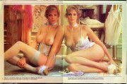
Quote:
In addition to separating the two halves and correcting each one separately, adjustments sometimes need to be made in the printing color space (CMYK) instead of sticking with the typical RGB color space. The reason behind this is that the color error was not committed in the photo lab, but rather at the printer. And that's where it is easiest to correct. If you try to correct RGB curves you'd have to move two sliders simultaneously. In CMYK space you correct the color that is the problem: E.g. Not enough cyan or too much yellow. Here's what my adjustment attempt looks like: 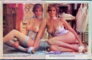 |
|
|
|
|
 |
|
|


 Best Porn Sites
 Linear Mode

