 Register on the forum now to remove ALL ads + popups + get access to tons of hidden content for members only!
|
|
#1 |
|
Veteran Member
Join Date: Mar 2008
Location: Trapped inside a scanner
Posts: 3,501
Thanks: 4,329
Thanked 61,925 Times in 3,411 Posts
           |
This is a somewhat controversial subject. Some people think that a scanned image shouldn't be color adjusted, that you should leave it as is because that's the way it was printed.
My feeling has always been that if the people look orange, yellow, or pink, as frequently is the case with old style porn mags of the late 70s/early 80s done with a cheap printing process, something should be done about it to make it look more realistic. The problem: How to go about making it look more realistic. There are a several complications to take into consideration here including but not limited to... 1) Monitor quality - is the image being displayed on the monitor accurate. This was a problem back 10 years ago and it's even more of a problem today with the dominance of LCD monitors. For years after they hit the market I kept avoiding LCDs. CRTs, despite whatever inherent flaws they may have in terms of color accuracy, didn't have the additional problem LCDs continue to have to this day in regards to viewing angles. I have yet to see an LCD that didn't do some sort of color/brightness shift in parts of the screen where you weren't looking head on. Do this: plant your head in one direction at your LCD and then move your body left/right/up down parallel to the LCD. You'll notice that the parts of the screen not directly in front of you will shift in brightness and saturation, with the parts of the screen not directly in front of you losing contrast and saturation as you move your head. This plays havok with ones ability to properly assess an image's correct color and contrast. 2) What did the original photograph look like? Since the the vast majority of printed images are either over saturated or tinted badly you really don't know what the photograph was supposed to look like. What I have been doing is using a rather fluid set of procedures to get the flesh tones more realistic. But it's a process that has produced a lot of hits and misses. Sometimes I just can't get the fleshtones right. This is particularly true for images that skew pink, less so for images that skew red, orange, or particularly yellow. I start off by de-saturating the image in Photoshop. The amount of de-saturation depends greatly on the level of saturation the image has. Sometimes I have to desaturate by a level of -40 in extreme cases. I then open up color balance and do further adjustments, usually lowering the amounts across the Shadows and Midtones but being more delicate with the highlights. This is usually a two stage process where I do an initial pass and then make refinements in a second pass, mostly to the Midtones and some Highlights. I then follow up by adjusting the Levels to add contrast. Only after I'm done color adjusting do I downsize the image to 72 DPI and whatever dimensions I think the image is capable of supporting without losing detail. This process is far from perfect and I'm constantly looking for ways to improve upon it. I'd be interested in hearing any ideas for color correction. I've dabbled with curves but that's a process I just can't figure out properly. |
|
|

|
| The Following 22 Users Say Thank You to DARPA For This Useful Post: |
|
|
|
|
#3 |
|
Veteran Member
Join Date: Mar 2008
Location: Trapped inside a scanner
Posts: 3,501
Thanks: 4,329
Thanked 61,925 Times in 3,411 Posts
           |
Ha!
No.  I just know crappy/cheap printing when I see it.  The worst of the worst are the ones where the color registration is misaligned. Not only does that result in images with little blue/red/yellow halos surrounding everything, it blurs the damn image and makes shapening masks useless. Nothing you can do to fix this but suck it up and put it out as is. I tried messing with the color channels individually and moving the plates around in Photoshop but the results showed it was a lot of effort for a limited payoff and not really worth the trouble. |
|
|

|
|
|
#4 |
|
Veteran Member
Join Date: Mar 2010
Posts: 2,930
Thanks: 1,855
Thanked 81,364 Times in 2,901 Posts
           |
DARPA,
when I started scanning in 2001, I tried out almost all corrections you described. But I hardly was pleased with the results because the scanner added also to the color faults. I remember working 10 minutes or more on each scan on color corrections alone, not to speak of other revisions that had to be done (such as removing spots and blemishes or stitching images). Unnecessary to say that the scan did not look better after the color correction, it just looked different. Today, and three scanners later, I hardly do any color corrections on the scans, with the exception of "Automatic Saturation Enhancement" in Paint Shop Pro 7. I use the "neutral" positions for bias and strength which add or reduce saturation depending on the saturation level in the scan. If pictures in a magazine have a color fault or were intentionally given a "special" look, I leave the colors as they are. A reader of this magazine can't do anything against it either - he won't use a color filter or tinted glasses  Just my 2 cents... |
|
|

|
| The Following 8 Users Say Thank You to ulitka For This Useful Post: |
|
|
#5 | ||
|
Moderator
Join Date: Jul 2007
Location: Upper left corner
Posts: 7,200
Thanks: 47,931
Thanked 83,396 Times in 7,194 Posts
           |
Quote:
Quote:
There are a lot of useful aspects to this. One is that with only two color channels to work with, you have fewer adjustments to make to do your color correction. The other is that you can work on the Luminence channel in isolation to sharpen, blur, or remove image details without getting a lot of color artifacts |
||
|
|

|
|
|
#6 |
|
R.I.P.
Join Date: Nov 2005
Location: Gone But Not Forgotten
Posts: 6,562
Thanks: 37,001
Thanked 77,384 Times in 5,393 Posts
           |
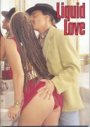
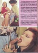
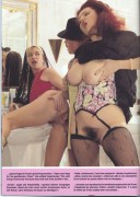
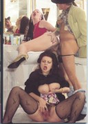
I guess this author recalibrated his scanner during the scanning process, the contast did change dramatically after pic #9
__________________
We got to let love rule. |
|
|

|
|
|
#7 |
|
Big whoop, wanna fight about it.
Join Date: Jul 2007
Posts: 1,674
Thanks: 14,779
Thanked 52,474 Times in 1,638 Posts
           |
I've used adobe PS and corel for years now and corel photopaint
Image , Adjust & auto equelise is a good tool for these problems. If anything it's a good starting point before trying anything else   
__________________
To view links or images in signatures your post count must be 0 or greater. You currently have 0 posts. To view links or images in signatures your post count must be 0 or greater. You currently have 0 posts. To view links or images in signatures your post count must be 0 or greater. You currently have 0 posts. To view links or images in signatures your post count must be 0 or greater. You currently have 0 posts. To view links or images in signatures your post count must be 0 or greater. You currently have 0 posts. |
|
|

|
|
|
#8 |
|
Vintage Member
Join Date: Jul 2010
Posts: 823
Thanks: 20
Thanked 24,261 Times in 822 Posts
           |
Adjusting the color in a scan can be frustrating, but it doesn't have to be. First let me say that I think that it's okay to change the colors, because in most of the 3rd rate magazines, the people in them look orange. People are not orange, and that's not the picture that the photographer took.
Second, these third rate magazines have poor printing quality. If you bought the first issue off the press, and someone bought the 20,000th issue, they wouldn't look the same. Those magazines don't have the strict quality control that a magazine like Playboy has. Third, even if you use a good colorimeter to calibrate your monitor, that doesn't mean that whoever downloads your scans will have their monitor calibrated. What looks perfect on your calibrated monitor might look terrible on his uncalibrated monitor. When I scanned a picture into Photoshop, the first thing I would do after cropping it would be to use the Kodak ROC filter on it.(a plugin for PhotoShop). This filter removes the reddish cast on the picture. This filter usually removed too much red and the picture looked bad. No problem, just fade the effect. I usually would fade it down to 0% and slowly increase the slider till I got what I was looking for. Once I got the best look from using the fade option, I would then open the levels histogram and adjust the sliders till I got what I wanted. Next I adjusted the brightness and contrast, if the picture needed it. If I wasn't happy with the results, I would play around with the individual colors in the saturation adjustment box. Sometimes I'd need to adjust the color balance also. Once that was finished, I'd clone out the imperfections, then I'd resize the picture to the desired size, then apply the unsharpen mask. That was usually it. The thing to keep in mind, and this is the biggest time saver, is to know what adjustments and filters WON'T work. Once you learn that, you will save time and effort by not trying to make adjustments with those tools and finding that they don't help. Anyway, I hope this helps.  Last edited by Dekoda; July 9th, 2010 at 10:27 PM.. |
|
|

|
|
|
#9 |
|
Veteran Member
Join Date: Mar 2009
Posts: 6,648
Thanks: 59,873
Thanked 488,172 Times in 6,656 Posts
           |
I have this picture from Mexican PB that I'm going to merge but as you can see the right side of the picture is much greener than the left. This is not a scanning error. It was printed this way.
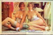 I use Photoshop Elements 9 as my graphics program. So far I've tried changing the tint, temperature, adjust color for skin tone, and a number of other adjustments. Nothing comes close to fixing the problem. In the picture between the heads of the 2 models the background is brown on one side and green on the other. Is there some way of making the right side of the picture more brown? |
|
|

|
| The Following 7 Users Say Thank You to masque51 For This Useful Post: |
|
|
#10 |
|
Former Staff
Join Date: Jan 2007
Location: The Burren, Eireann
Posts: 4,355
Thanks: 23,582
Thanked 59,752 Times in 4,180 Posts
           |
Quote:
|
|
|

|
 |
| Thread Tools | |
| Display Modes | |
|
|